

While I originally planned to discuss 1990s music-related topics within both of this week’s blog posts because my topic covers a different decade each week, I found that using such specifications was difficult in finding strong infographic examples. So I simply chose to analyze two infographics reporting on listening preferences and sales in the music industry, both international and domestic.

This first infographic titled “Music Industry: A Closer Look Into Streaming Services” was created by infographic.ly and divides information into five components. The poster’s use of just three colors – one neutral and two neon tones – provides a visually appealing factor that coincides with its modern statistics. There are two fonts used, ultimately creating a consistent tone throughout the piece. One bold copy headlines the poster and one narrow, taller font identifies the supporting statistics.
Besides the title, the first delivery of information that my eye is drawn to shares that “music consumption formats have shifted due to growth of digital platforms,” then uses small images to demonstrate that these formats come as downloads, digital media players and streaming services. In all honesty, I do not believe that this snippet of information is necessary.
The next three boxes are much more helpful, as they provide information in the form of creatively-displayed statistics. The first section uses a bar graph, arranged from largest to smallest, to show the allocations of worldwide listening revenue. Each bar is represented by a correlating image but I do wish that further explanation was provided to add context to the subdivisions. The other two are easily legible, with one using graphics resembling audio faders to show global digital music revenue across five leading countries and the other listing the listener/subscriber data of the four major streaming services under Spotify.
The last category is the largest of all and displays the statistical impacts of the largest music streaming service, Spotify. It shows the different plans it offers, perks, most notable tracks/artist withdrawals, and the company’s overall value.
Overall, I believe that this infographic served its purpose in providing a closer look into music streaming services. While it needed tweaking, all changes are minor and the data is effectively conveyed.
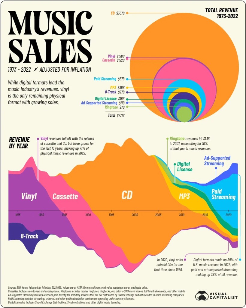
The second infographic was created by Visual Capitalist and covers music sales in the United States from 1973 to 2022. In my opinion, this text-heavy profile is much more visually appealing than the other. It pairs a retro-style header and an italicized body copy with a vibrant range of tones, steering clear of monotonous shapes and lines.
The first of two visuals illustrates the total revenue outlets of music listening. It uses overlapping circles to demonstrate that as of 2022, CD was the most profitable listening format by almost three times that of the runner-up vinyl records. The second chart uses colorful sound-wave-like shapes to distribute the revenue on a timeline spanning 49 years. The information of each graphic coincides with one another, but its creators chose to represent the music revenue in two formats so that readers could better understand the data. There are also cohesive explanations of each listening format to provide further clarity.
I also believe that this infographic is strongly organized and successfully balances text and visuals. If I had a friend looking to learn more about the financial components of the American music industry, I would surely recommend this graphic.

Leave a comment